When it comes to football, few clubs have as much history and prestige as Inter Milan. But beyond trophies, legendary players, and unforgettable matches, clubs also rely on something that fans often take for granted: their visual identity. The crest on the shirt isn’t just a design—it’s a statement of culture, tradition, and belonging.
In 2021, Inter Milan unveiled a striking new logo and rebrand, created by the German design studio Bureau Borsche. And while it may look simple at first glance, this redesign carries deep meaning, bold strategy, and a fresh vision for the future.
If you’ve been wondering why the club made this move and what it actually represents, let’s break it down together.
1. Why Inter Milan Changed Its Logo
For over a century, Inter Milan carried forward a crest that was first designed in 1908 by Giorgio Muggiani, one of the club’s founding members who also happened to be a graphic designer, painter, caricaturist, and even a referee. That circular badge with overlapping letters became iconic.
So why change it now?
The answer lies in modern communication. In today’s world, football clubs aren’t just competing on the pitch—they’re competing for digital attention, global recognition, and cultural relevance. Inter wanted a streamlined, minimalist, and versatile logo that could adapt seamlessly to screens, social media, merchandise, and global branding.
As the club put it:
“The aim is to make the Inter brand relevant and recognisable beyond its fanbase… to reach younger and international audiences, while still reflecting our tradition.”
In other words, this wasn’t just a design update—it was a cultural strategy.
2. A Minimalist Approach With Maximum Impact
Take a look at the before and after and you’ll notice something subtle but powerful.
-
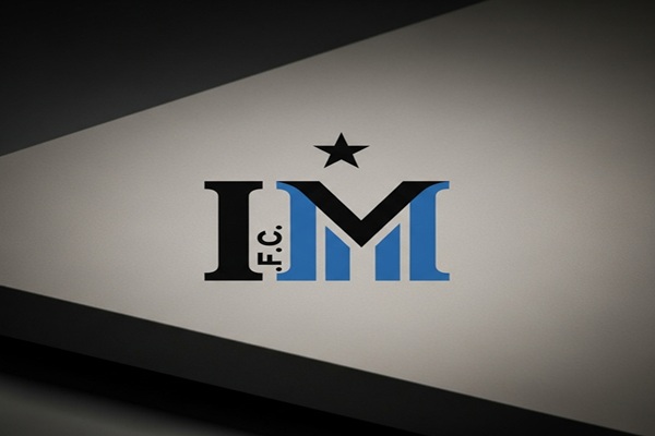
The original crest had the letters F, C, I, and M woven into its circular design.
-
The new version drops the F and C, keeping only the I and M.
-
Those two letters now stand boldly in the center, framed by a clean circle.
The color scheme remains faithful to Inter’s DNA: black and the distinctive Nerazzurri blue, but with a slightly more vibrant hue that pops on digital platforms.
The result? A logo that feels both classic and futuristic, instantly recognizable yet easier to use in today’s fast-moving media world.
3. The Hidden Meaning: “I AM”
Here’s where things get clever. Inter’s new logo isn’t just about initials. The “I M” in the design is also a play on the phrase “I Am.”
According to the club, this subtle wordplay allows the badge to double as a statement of identity. It’s not just about the club saying “I am Inter”—it’s also about the fans saying it. Every supporter, from Milan to Jakarta, can connect to that identity:
-
I Am Proud.
-
I Am Nerazzurri.
-
I Am Inter.
This is branding at its smartest—making fans feel like they are part of the crest itself.
4. More Than Football: A Cultural Icon
Inter Milan’s ambition goes far beyond the football pitch. With this rebrand, the club made it clear: they want to be seen as a global cultural icon, not just a sports team.
The refreshed logo and branding were designed to highlight values like:
-
Inclusion – celebrating diversity among fans and players.
-
Style – embracing Milan’s reputation as a fashion capital.
-
Innovation – adapting to new digital and cultural landscapes.
This aligns Inter with brands outside the world of sport—positioning themselves more like Nike, Apple, or Gucci, rather than just another football club.
5. Why Football Clubs Are Redesigning Logos
Inter isn’t alone in this trend. Over the past decade, many major football clubs and even global corporations have embraced simplified, flat designs. Think Juventus, Manchester City, or even companies like BMW and Warner Bros.
The reasons are clear:
-
Digital Adaptability: Logos need to look sharp on tiny smartphone screens, social media avatars, and apps.
-
Global Marketing: Simple logos translate better across languages and cultures.
-
Fashion and Lifestyle: A clean, minimal logo works better on streetwear, collabs, and merchandise.
By joining this movement, Inter Milan is ensuring its brand feels timeless yet modern—a delicate balance for any heritage institution.
6. The Reaction From Fans and Critics
Of course, no major rebrand comes without debate. Some traditional fans felt the removal of F.C. downplayed the club’s football roots. Others questioned whether the design was too simplistic compared to its historic predecessor.
But many welcomed the change, appreciating its boldness, versatility, and international appeal. As the new crest appeared on shirts, merchandise, and across social media campaigns, it began to settle in as the new face of Inter Milan.
And as often happens with design, time has a way of cementing change. What feels unusual at first often becomes the new normal—just ask Juventus fans.
Also Read : THE WORLD’S FIRST ‘MEME MUSEUM’ IS NOW OPEN
7. What This Means for Inter’s Future
So what does this all add up to?
Inter’s new logo represents more than a graphic update. It’s a symbolic step into the future:
-
A Global Brand: One that appeals to fans in Asia, the Americas, and beyond.
-
A Digital-First Identity: Built for Instagram, TikTok, and eSports just as much as for the San Siro.
-
A Cultural Statement: Positioning Inter Milan as not only a football club but a lifestyle brand.
In many ways, this rebrand is about telling the world: Inter isn’t just part of football culture—it is part of global culture.
Final Thoughts
The new Inter Milan logo proves that simplicity can be powerful. By revisiting its roots, modernizing its style, and embedding clever symbolism, the club has created an identity that works for both tradition and transformation.
It’s clean, adaptable, and deeply meaningful—qualities that make it more than just a logo. It’s a reminder of what football clubs are becoming today: global icons of sport, style, and culture.
Whether you’re a lifelong Nerazzurri supporter or just someone interested in design trends, one thing is clear—this isn’t just about a badge on a jersey. It’s about Inter Milan declaring to the world: “I Am Inter.”